 08-26-2015, 01:20 PM
|
#1
|
|
Custom User Title Here
Join Date: Mar 2012
Location: Ft. Leonard Wood
Posts: 6,169
|
Adding "986" Emblem...?
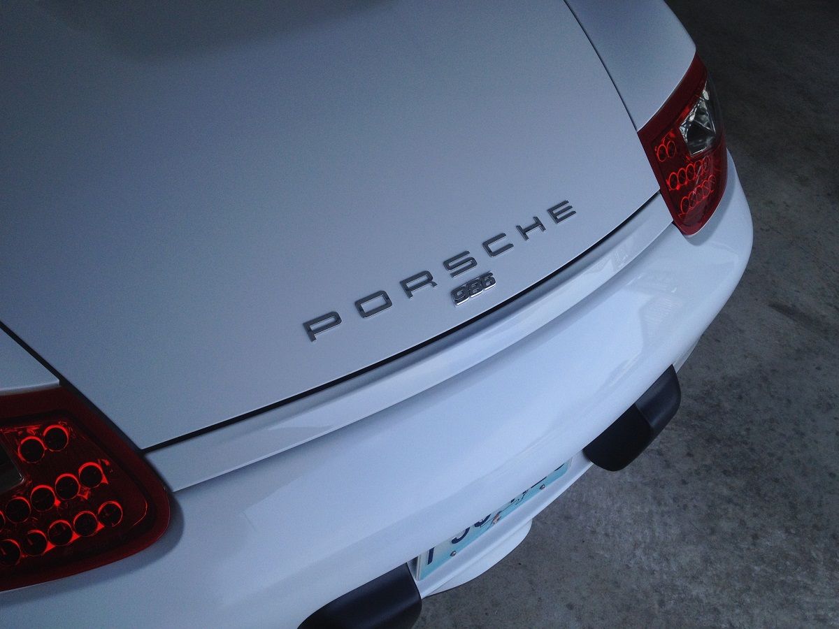
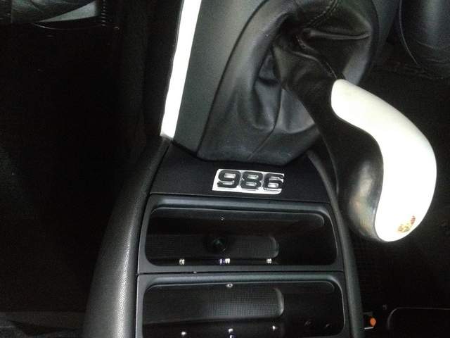
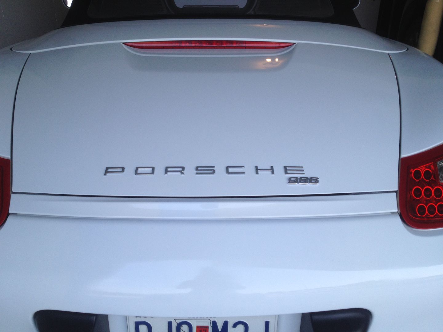
I ordered these block italic chrome numbers to put on the "batwing" as seen below, but I think they might look ok on the trunk, also.
$0.99 per number, $0.99 combined shipping, $3.96 total. 2 weeks, shipped from Taiwan.
 1 Piece Chrome Individual Letters 3D Emblem Badge Sticker Number Alphapet Logo | eBay 1 Piece Chrome Individual Letters 3D Emblem Badge Sticker Number Alphapet Logo | eBay
Thoughts?

this will look better without the white background, I promise. 

#1 - Centered (probably the best, if I do it at all)


#2 - Offset (straight)

#3 - Offset (following the line of trunk)

#4 - Moderate Offset

#5

#6 - Centered Above

__________________
https://youtube.com/@UnwindTimeVintageWatchMuseum
Last edited by particlewave; 08-26-2015 at 03:44 PM.
|

|

|
 08-26-2015, 01:51 PM
|
#2
|
|
Motorist & Coffee Drinker
Join Date: Jul 2014
Location: Oklahoma
Posts: 3,958
|
You have the numbers upside-down in all the pictures. You need to turn it over.

|

|

|
 08-26-2015, 01:58 PM
|
#3
|
|
Registered User
Join Date: Jul 2014
Location: Larkspur, CO
Posts: 243
|
I like the trunk offset #4, but would like to see the "9" left aligned and parallel to the "E", or the left of the "9" aligned to the center of the "E"...
|

|

|
 08-26-2015, 03:32 PM
|
#4
|
|
Registered User
Join Date: Mar 2014
Location: Eastern NC
Posts: 701
|
I like #4 Best and agree with iancole. I would like to see the view aligned closer with the center or leading edge of the E.
|

|

|
 08-26-2015, 03:35 PM
|
#5
|
|
Custom User Title Here
Join Date: Mar 2012
Location: Ft. Leonard Wood
Posts: 6,169
|
Thanks for the input!
For the record: I'm just toying with this idea, not 100% set on it yet (but it does look nice in person  ).


__________________
https://youtube.com/@UnwindTimeVintageWatchMuseum
Last edited by particlewave; 08-26-2015 at 03:40 PM.
|

|

|
 08-26-2015, 08:49 PM
|
#6
|
|
Registered User
Join Date: Oct 2014
Location: Santa Rosa, CA
Posts: 520
|
It looks good on the batwing!
I think I am going to get some of those 
__________________
2003 2.7 Boxster - Tiptronic - Carrera wheels - OBC - Red calipers - Cat pipes - Modified muffler - Rear speakers - K&N - Litronics
2006 V6 Mustang
2008 ML 350
|

|

|
 08-26-2015, 09:29 PM
|
#7
|
|
I am my own mechanic....
Join Date: Feb 2013
Location: Salt Lake City, UT
Posts: 3,432
|
I was thinking about adding my sig line under the Boxster S wording.
__________________
'04 Boxster S 50 Jahre 550 Spyder Anniversary Special Edition, 851 of 1953, 6-sp, IMS/RMS, GT Metallic silver, cocoa brown leather SOLD to member Broken Linkage.
'08 VW Touareg T-3 wife's car
'13 F150 Super Crew long bed 4x4 w/ Ego Boost
|

|

|
 08-26-2015, 11:05 PM
|
#8
|
|
Custom User Title Here
Join Date: Mar 2012
Location: Ft. Leonard Wood
Posts: 6,169
|
Some issues I have with it:
1) I wish the numbers had thinner lines to better match the "Porsche", but it's really not that apparent in person and looks nice. They just don't photograph well.
2) Getting the numbers to look correct with the curve of the existing emblem (which is why I think centered may be best).
3) The number spacing is too tight in my pictures. Not a problem, of course, since I can space them however I like.
I've ordered another set, so I'll play with it more when they arrive. I'll find the best aesthetic arrangement and try it on for a while. I can always remove them at any time. 
__________________
https://youtube.com/@UnwindTimeVintageWatchMuseum
|

|

|
 08-26-2015, 11:10 PM
|
#9
|
|
Custom User Title Here
Join Date: Mar 2012
Location: Ft. Leonard Wood
Posts: 6,169
|
Quote:
Originally Posted by EJ-Fresno

It looks good on the batwing!
I think I am going to get some of those  |
The batwing does look nice. I think I'd prefer slightly smaller numbers, though. I'll have to see if I can find some.
I increased the spacing from 2mm to 4mm.

__________________
https://youtube.com/@UnwindTimeVintageWatchMuseum
Last edited by particlewave; 08-26-2015 at 11:41 PM.
|

|

|
 08-27-2015, 04:19 AM
|
#10
|
|
Registered User
Join Date: Feb 2013
Location: Cranston RI
Posts: 902
|
Very cool! Thanks for posting!
__________________
99 Porsche Boxster
|

|

|
 08-27-2015, 05:17 AM
|
#11
|
|
Registered User
Join Date: Jul 2014
Location: Listowel, Ontario, Canada
Posts: 1,120
|
I do like the numbers centered as posted in #1. Not even sure you have to worry about that slight curve with only the 3 numbers. Also like #4 as originally posted.
Not a fan of them on the batwing. Hidden behind the shift knob, just seems a bit pointless and overkill.
What are they made of? Will they withstand the wind and rain and snow and slush and stay looking good and inplace?
__________________
2011 Boxster 987.2 Arctic silver / Black leather, PDK with Sports Chrono Package Plus
|

|

|
 08-27-2015, 05:48 AM
|
#12
|
|
I am my own mechanic....
Join Date: Feb 2013
Location: Salt Lake City, UT
Posts: 3,432
|
The increased spacing really fixed it for me. Looks way better.
__________________
'04 Boxster S 50 Jahre 550 Spyder Anniversary Special Edition, 851 of 1953, 6-sp, IMS/RMS, GT Metallic silver, cocoa brown leather SOLD to member Broken Linkage.
'08 VW Touareg T-3 wife's car
'13 F150 Super Crew long bed 4x4 w/ Ego Boost
|

|

|
 08-27-2015, 06:23 AM
|
#13
|
|
Registered User
Join Date: Dec 2013
Location: Greenville, S.C.
Posts: 2,670
|
Quote:
Originally Posted by particlewave

Thanks for the input!
For the record: I'm just toying with this idea, not 100% set on it yet (but it does look nice in person  ).

 |
That looks absolutely outstanding! My car is debadged but that looks like the only alternative I would prefer! I think I may have to do that to mine.
|

|

|
 08-27-2015, 08:22 AM
|
#14
|
|
X GI
Join Date: Nov 2014
Location: Pa
Posts: 80
|
I am just the opposite.. I took the Boxster emblem off the trunk for the clean stealth look.
__________________
Daily Drivers:
2013 Passat SE
2001 RX300
1999 Boxster
|

|

|
 08-27-2015, 08:25 AM
|
#15
|
|
Registered User
Join Date: Jun 2012
Location: Bedford, TX
Posts: 2,759
|
Personally, I like it the way you have it. If you do go this route, the numbers have to be thinner to match the current script IMO. I think they are ok on the batwing but again, thinner script would be better.
__________________
______________________________________________
2001 Boxster S Lapis Blue
TS Cat Bypass Pipes and exhaust
iPad Mini Dash Install
DEPO Tail Lights
|

|

|
 08-27-2015, 08:30 AM
|
#16
|
|
Registered User
Join Date: Nov 2004
Location: New Jersey
Posts: 8,709
|
paint the Porsche letters with a plasti dip in high gloss red and paint the 986 in the signal green color of your calipers, and align like in the last pic, off to the right. And paint your bumperrettes white.
__________________
GT3 Recaro Seats - Boxster Red
GT3 Aero / Carrera 18" 5 spoke / Potenza RE-11
Fabspeed Headers & Noise Maker
BORN: March 2000 - FINLAND
IMS#1 REPLACED: April 2010 - NEW JERSEY -- LNE DUAL ROW
Last edited by Perfectlap; 08-27-2015 at 08:32 AM.
|

|

|
 08-27-2015, 08:54 AM
|
#17
|
|
Custom User Title Here
Join Date: Mar 2012
Location: Ft. Leonard Wood
Posts: 6,169
|
Quote:
Originally Posted by BruceH

Personally, I like it the way you have it. If you do go this route, the numbers have to be thinner to match the current script IMO. I think they are ok on the batwing but again, thinner script would be better.
|
I'm inclined to agree with you. I scoured that Internet thing for a couple hours last night and couldn't find any script smaller than this, but I'll keep an eye out. I may have to put some aluminum on a water jet and make them. 
It was fun, though. At $3.96, I'm not out much $. 
__________________
https://youtube.com/@UnwindTimeVintageWatchMuseum
|

|

|
 08-27-2015, 08:55 AM
|
#18
|
|
Custom User Title Here
Join Date: Mar 2012
Location: Ft. Leonard Wood
Posts: 6,169
|
Quote:
Originally Posted by Perfectlap

paint the Porsche letters with a plasti dip in high gloss red and paint the 986 in the signal green color of your calipers, and align like in the last pic, off to the right. And paint your bumperrettes white.
|
Sending this off to photoshop...
__________________
https://youtube.com/@UnwindTimeVintageWatchMuseum
|

|

|
 08-27-2015, 09:03 AM
|
#19
|
|
Registered User
Join Date: Nov 2004
Location: New Jersey
Posts: 8,709
|
^ for your spoiler decal, if you have one... paint the spoiler black to freshen up, and then add a signal green and red decal that says 986 Spyder
__________________
GT3 Recaro Seats - Boxster Red
GT3 Aero / Carrera 18" 5 spoke / Potenza RE-11
Fabspeed Headers & Noise Maker
BORN: March 2000 - FINLAND
IMS#1 REPLACED: April 2010 - NEW JERSEY -- LNE DUAL ROW
|

|

|
 08-27-2015, 09:36 AM
|
#20
|
|
Registered User
Join Date: Nov 2012
Location: SW Okla
Posts: 1,117
|
Quote:
Originally Posted by particlewave

I'm inclined to agree with you. I scoured that Internet thing for a couple hours last night and couldn't find any script smaller than this, but I'll keep an eye out. I may have to put some aluminum on a water jet and make them. 
It was fun, though. At $3.96, I'm not out much $.  |
Here's factory original 968 emblems that have been "repurposed". I have a set to go on my orange/black Boxster you helped photoshop the other night. I've painted them in orange.
Suncoast Porsche Parts & Accessories Emblem - "986" in Black
Just a bit more than $3.96 though...
__________________
I think I have a Porsche problem...
|

|

|
 Posting Rules
|
You may not post new threads
You may not post replies
You may not post attachments
You may not edit your posts
HTML code is On
|
|
|
All times are GMT -8. The time now is 11:21 AM.
| |