Quote:
Originally Posted by JonD

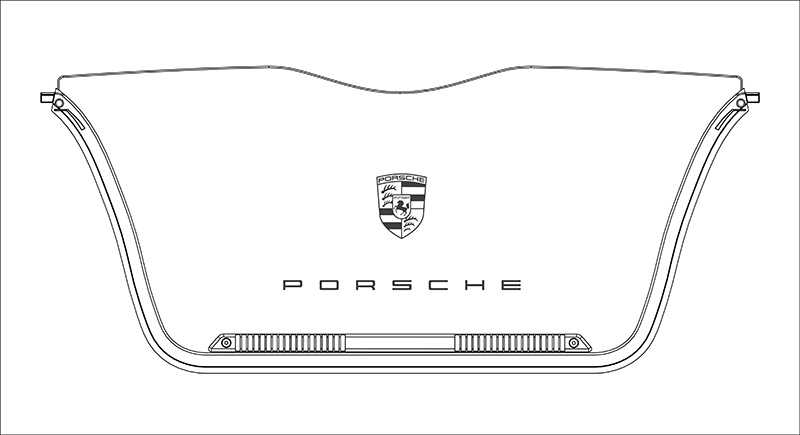
I was just wondering, if it would be possible to have a little more spacing between the PORSCHE letters on the screen?
Something like P O R S C H E
|
Hey Jon, kind words mate, thx. All the same to you. Cool car also


Quote:
Originally Posted by JonD

I know it's just a personal preference thing but Porsche themselves seem to space the letters out a bit when they stick them on cars.
|
I'm not 100% sure its a pref thing, think its designed that way - for a wide trunk anyway! You wouldn't want the P word to look small on a wide object, especially not for a big brand lol. Porsche AG had to give up the tall fat Porsche branding, its passed now. The new pcar rear badge is indeed the stretched p o . However P brand logo remains the same anywhere else. The True Purists!
Our WD is not a wide object at all. Its mini. I see the original idea best fit (there, sharing personal opinions with you lol). I think you should just go for a crest alone - subtle, nice edgy glow and that's it mate. You got your P badge already on your hood.
In amber of course. Your red tone gives a smooth feel to the car, and amber gives exactly that effect. Also nearly exact same color as your gauges and interior lighting, can't make the diff if not told I'm sure.
some inspiration for you (and lots of blah, sry)